
In this Blog, Positive Painting Colours, I think it will be interesting to see how Colour can be used, to Sell our Art Creations. To see further if Colour can be used in other ways, and if Yes, how and why? I will also include, Two colourful Art Creations, I have made for inclusion in this Blog.
Use the hidden meaning of Colour in your Art–colour is a powerful tool to use in your Art creating, because a colour or colours can bring in the Viewers focus, right into and onto your Art. Colours also have a Positive effect on our Mental State and overall Health, as individuals. Colours can also have the great benefits of relaxing and calming our Minds and Our whole bodies.
Colours in our Art and in our Designs, help us as Genuine individuals to show our Natural style and good taste, in Interior design, in Graphic design, in Advertising and lastly as Creative Art Creators of Successful Art.
As Artists we Internally teach ourselves naturally, which colours are Positive or Negative in our Art Creations, and we use the Colours to our Advantage in our Art, to Entice people to our Art Works.
We examine how the Cool and Warmer colours, Affect our audience, via the Colours we use, in our Art work.
Cool colours--Blue under tones, Calm the mind. Many decorators use Blues — in quiet environments. Blue lowers the Heart rate and Slows down, our hunger.
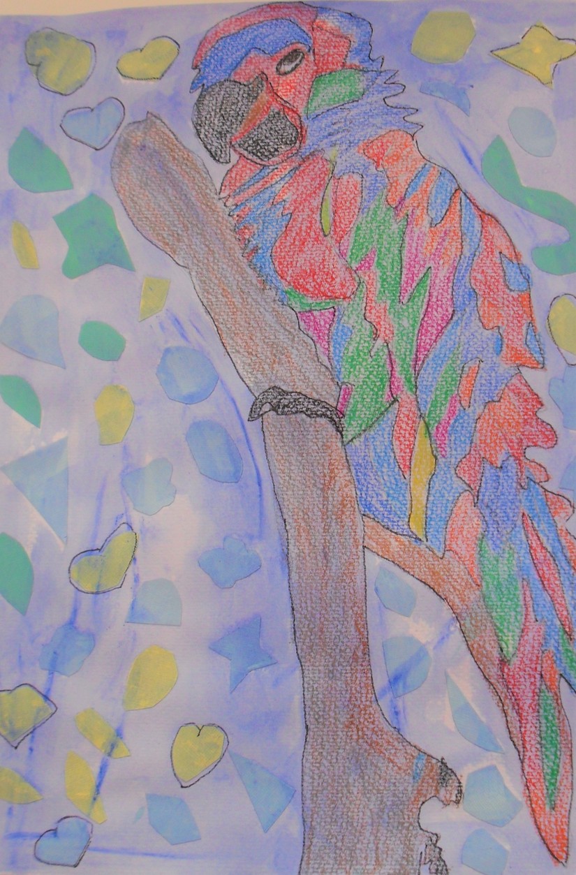
This painting, Mixed Media Collage, was made in the Preparation Stage on Creatives Acid free, Watercolour paper. Using the Creatives Coloured Card stock, and I cut the shapes, and after drawing the Bird, I glued the shapes on the Water colour paper. I used Mont Marte–Matt Colours, Cobalt blue and a littlest of the Phthalo blue, to make the wash. When dry, I used Colourful Crayons, to colour the Bird, using both Cool and Warm colours. To complete the Painting, I used for the outline of the Picture, a Sharpie, Black Fine Marker. I think, the completed Painting looks both inviting and interesting in the both the Cool and Warm colours I have used.
Gummy and Bird. Mixed Media Collage. By: Marie. Crimi. 2019.
Blue is a Strong and dependable Colour. Blue is used in Uniforms and in Business suits. Dark Blue is the Colour mostly worn by Top Professionals, in our Societies. Blue and Greens are used to advertise, Medicines and Health care products. In Theatres Green Walls calm, the Nervous system of Actors. Dark green is best in Studios and in Offices. Green is the go to Colour, for Our Outdoor products.
Warm colours–the Yellow undertones, can Insight happiness or Pure violence. Red, orange, yellow colours, make you, Hungry and Thirsty for alcohol. Red is the colour, that Attracts people, and Increases their heart rates.
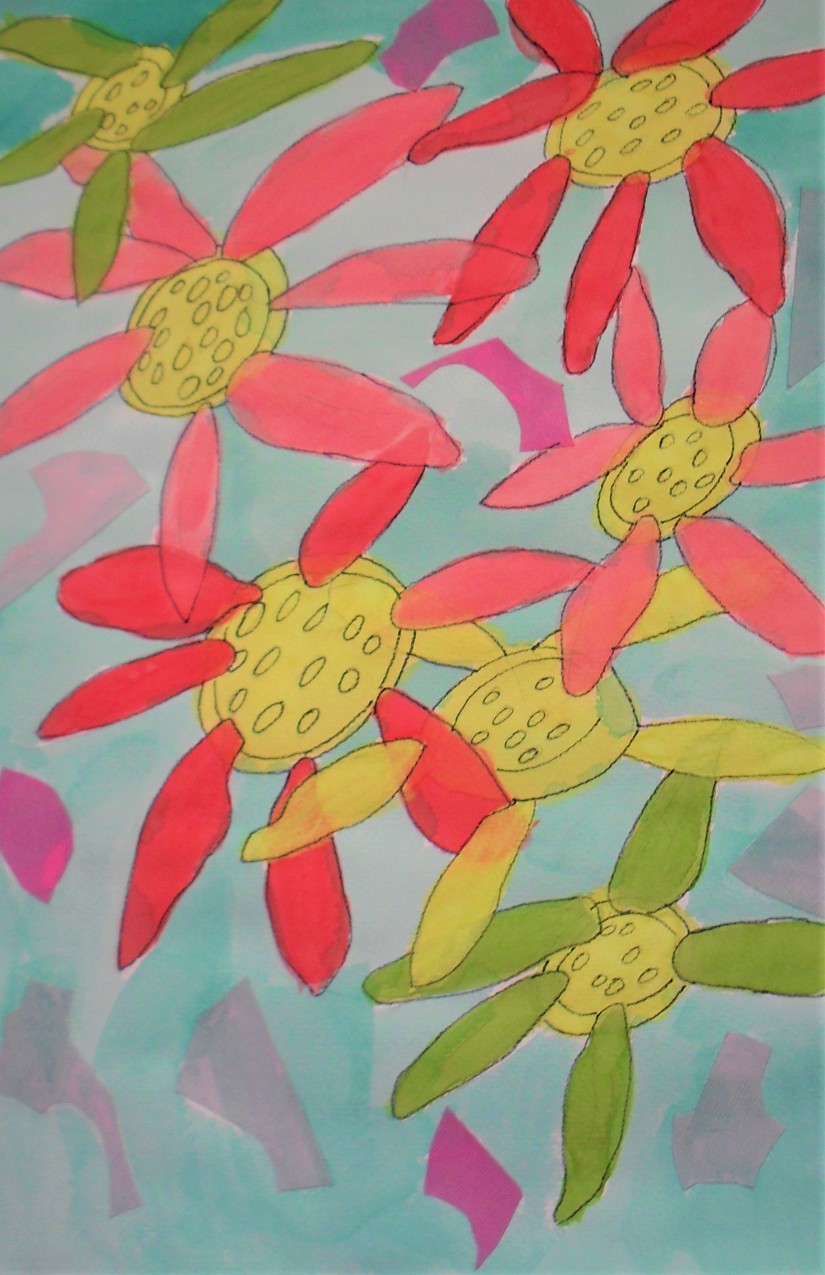
The painting that follows is a Painting made as a Mixed Media Collage, in Creative, Colourful Watercolours, on Acid free, Creatives Watercolour paper. For the Collage part which was made first, Creatives Acid free, Coloured Card stock, shapes were made and glued onto the Watercolour paper. Then I drew the Flowers, over the top, in a 2B, Eco Lead Pencil. I mixed Acrylic Silver Series–Mont Marte, Matte colours, Virdian and a littlest Cobalt blue, with water, and I painted this onto the Collage. When dried, I used Watercolours to colour the painting. To complete this painting, I traced around the Flowers in, Sharpie, Black Fine marker. I am thinking the result is Unique, and the Colours, are the Enticing Factor in this painting.
Spring Flowers. Mixed Media Collage. By: Marie. Crimi. 2019.
The Colour, History Theory–the Philosopher, Leone Bettista Alberti (c. 1435) and the Artist/inventor, Leonardo da Vinci (c. 1495) were the First to write on Colours.
It was in 1666, that Isaac Newton’s Theory of Colour, and the Primary colours was introduced.
After Newton’s Colour Theory, Moses Harris created the First colour wheel, Red, blue, yellow, as the Primary colours.
In the early Twentieth century, the German painter Johannes Itten, added the Secondary and Tertiary colours. Also gave us the Idea of the, Warm and the Cool colours, and the fact, that these Shades have Either the Warm or a Cool base.
The Complementary and Colour Harmony, give a Great visual impact, when they Lie near to each Other. The complimentary colours, are Opposite, to each other on the Colour wheel.
The Meaning of Colour
- Red–Strength romance excitement, vitality, physical power, outgoing, ambitious and impulsive.
- Orange–is a Cheerful colour.
- Yellow–Sunshine, represents light.
- Green–Colour of harmony, balance, security.
- Blue–Sea and sky, cool expansiveness and openness soft and soothing, compassionate and caring.
- Purple–a Regal colour, a dignified colour, you need to use with discretion. This colour, is Tiring on the Eyes, and can give, a Sense of frustration.
- Brown–Is Living wood and Earth, can be Rich and Subtle and extraordinary. It is both a Cool and Warm colour. A Steady, dependable, conservative, conscientious and a reliable colour.
- Gray–is a Cautious, comprising colour. Gray gives a sense of peace and serenity.
- White–Is Symbolic of safety cleanliness and purity. Gives the Impression of youth, perfection and innocence.
- Black–A Mysterious, hidden colour, gives the feeling of Evil, darkness. Total Negative connotations, the symbol of grief.
The Successful Artist uses colour to their Art Advantage. The New Artist, is not aware of this total Power of Colours, on the viewer. All above information in the, (Fine Art Tips with Lori McNee).
Artist Colour Mediums or Media?
- Acrylic paint
- Blacklight paint
- Encaustic paint
- Fresco
- Gesso
- Glaze
- Gouche’
- Ink
- Latex paint
- Magna paint
- Oil paint
- Primer
- Stencil
- Ink wash
- Tempera or poster paint
- Vinyl paint (toxic, poisonous)
- Vitreous enamel
- Watercolour
The Common Drawing Materials
- Chalk
- Conte’
- Crayon
- Graphite
- Ink
- Pastel
- Pixel
Common Supports (Surfaces) for Drawing
- Canvas
- Card stock
- Concrete
- Fabric
- Glass
- Human body
- Metal
- Paper
- Plaster
- Scratchboard
- Stone
- Vallum
- Wood
Common Drawing Tools and Methods
- Brush
- Finger
- Pen
- Ballpoint pen
- Fountain pen
- Gel pen
- Technical pen
- Marker
- Pencil
- Mechanical pencil
- Coloured pencil
- Stylus
The above information is taken from the List of Art Media–Wikipedia, https://en. Wikipedia.org/wiki/list-of-artistic-media
Colouring Media, and Brand Names–for Commonly used Media in Art Creating.
Colour and Branding
Brands and Colour are linked. Colour offers the Instantaneous method for Conveying meaning and, a message, Without using words. Colour particularly, is the Visual component, that People remember about a Person’s Brand. The Colours, are then followed, by the Shapes and symbols, then Numbers and Finally the Descriptive words. Many of the Popular Recognizable brands in the world, Rely on Colours, as their Recognition factor, for find Sales. It is a Fact that Colours, Increases a Brands recognition by up to 80%, of the Time, for a Product.
Information and Web Addresses to use, for Positive painting Colours, in Your Art Creations.
- The Psychology of Colour Symbolism, A comprehensive online course. (From Jill Morton, Colour Matters).
- Use the Hidden Meaning of Colour in Your Art– fine art tips.com
- Bright and Positive Paintings (Leonid Afremov) https://www.beautiful.info/art-works/bright-and-positive
- The Role of Colours in Art Colours to use, to Enhance. https://emptyeasel.com
- Colours in Art: A look at the Many Combinations and Effects https://www.art-is-fun.com
- The Ultimate Collection of Colour in Art: https://art class curator.com
- Complementary Colours–Art Term/Tate https://www.tate.org.uk/art
In Conclusion to this Blog, in Positive Colours to use for Your Art Creations, we can agree that Colour is the deciding Factor that Attracts People, Initially to our Unique Art Creations, and then Finally, Sells The Colourful Expressive Art Piece. So Colour knowledge is One of the major, requirement, we need to learn and use in our work, to be Successful Artists.
Thank you for visiting this Blog, I hope it has been insightful and informative. If you have any questions, or any ideas or art thoughts or suggestions, please contact me. Have a Safe and Excellent Week. See YOU ALL, Next Blog.
I am creationsbymariec.art
https://www.myshopify shop.Artpaperdesignsmarie//shopify.com https://www.etsy.com/Artpaperdesignsmarie

You must be logged in to post a comment.